Friday, August 21, 2009

And the Last Shall be First (At Least Occasionally)

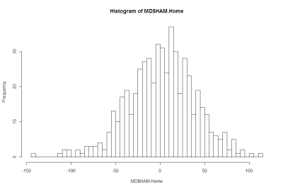
So far here on MAFL Stats we've learned that handicap-adjusted margins appear to be normally distributed with a mean of zero and a standard deviation of 37.7 points. That means that the unadjusted margin - from the favourite's viewpoint - will be normally distributed with a mean equal to minus the handicap and a standard deviation of 37.7 points. So, if we want to simulate the result of a single game we can generate a random Normal deviate (surely a statistical contradiction in terms) with this mean and standard deviation.

Alternatively, we can, if we want, work from the head-to-head prices if we're willing to assume that the overround attached to each team's price is the same. If we assume that, then the home team's probability of victory is the head-to-head price of the underdog divided by the sum of the favourite's head-to-head price and the underdog's head-to-head price.

So, for example, if the market was Carlton $3.00 / Geelong $1.36, then Carlton's probability of victory is 1.36 / (3.00 + 1.36) or about 31%. More generally let's call the probability we're considering P%.

Working backwards then we can ask: what value of x for a Normal distribution with mean 0 and standard deviation 37.7 puts P% of the distribution on the left? This value will be the appropriate handicap for this game.

Again an example might help, so let's return to the Carlton v Geelong game from earlier and ask what value of x for a Normal distribution with mean 0 and standard deviation 37.7 puts 31% of the distribution on the left? The answer is -18.5. This is the negative of the handicap that Carlton should receive, so Carlton should receive 18.5 points start. Put another way, the head-to-head prices imply that Geelong is expected to win by about 18.5 points.

With this result alone we can draw some fairly startling conclusions.

In a game with prices as per the Carlton v Geelong example above, we know that 69% of the time this match should result in a Geelong victory. But, given our empirically-based assumption about the inherent variability of a football contest, we also know that Carlton, as well as winning 31% of the time, will win by 6 goals or more about 1 time in 14, and will win by 10 goals or more a litle less than 1 time in 50. All of which is ordained to be exactly what we should expect when the underlying stochastic framework is that Geelong's victory margin should follow a Normal distribution with a mean of 18.8 points and a standard deviation of 37.7 points.

So, given only the head-to-head prices for each team, we could readily simulate the outcome of the same game as many times as we like and marvel at the frequency with which apparently extreme results occur. All this is largely because 37.7 points is a sizeable standard deviation.

Well if simulating one game is fun, imagine the joy there is to be had in simulating a whole season. And, following this logic, if simulating a season brings such bounteous enjoyment, simulating say 10,000 seasons must surely produce something close to ecstacy.

I'll let you be the judge of that.

Anyway, using the Wednesday noon (or nearest available) head-to-head TAB Sportsbet prices for each of Rounds 1 to 20, I've calculated the relevant team probabilities for each game using the method described above and then, in turn, used these probabilities to simulate the outcome of each game after first converting these probabilities into expected margins of victory.

(I could, of course, have just used the line betting handicaps but these are posted for some games on days other than Wednesday and I thought it'd be neater to use data that was all from the one day of the week. I'd also need to make an adjustment for those games where the start was 6.5 points as these are handled differently by TAB Sportsbet. In practice it probably wouldn't have made much difference.)

Next, armed with a simulation of the outcome of every game for the season, I've formed the competition ladder that these simulated results would have produced. Since my simulations are of the margins of victory and not of the actual game scores, I've needed to use points differential - that is, total points scored in all games less total points conceded - to separate teams with the same number of wins. As I've shown previously, this is almost always a distinction without a difference.

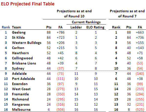
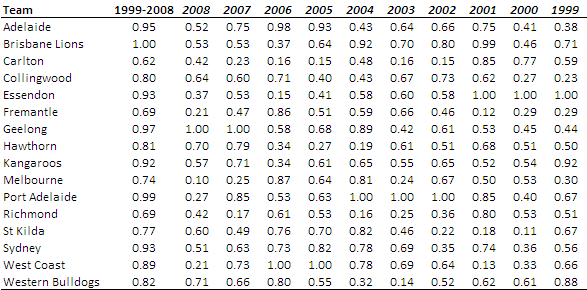
Lastly, I've repeated all this 10,000 times to generate a distribution of the ladder positions that might have eventuated for each team across an imaginary 10,000 seasons, each played under the same set of game probabilities, a summary of which I've depicted below. As you're reviewing these results keep in mind that every ladder has been produced using the same implicit probabilities derived from actual TAB Sportsbet prices for each game and so, in a sense, every ladder is completely consistent with what TAB Sportsbet 'expected'. The variability you're seeing in teams' final ladder positions is not due to my assuming, say, that Melbourne were a strong team in one season's simulation, an average team in another simulation, and a very weak team in another. Instead, it's because even weak teams occasionally get repeatedly lucky and finish much higher up the ladder than they might reasonably expect to. You know, the glorious uncertainty of sport and all that.


Consider the row for Geelong. It tells us that, based on the average ladder position across the 10,000 simulations, Geelong ranks 1st, based on its average ladder position of 1.5. The barchart in the 3rd column shows the aggregated results for all 10,000 simulations, the leftmost bar showing how often Geelong finished 1st, the next bar how often they finished 2nd, and so on.

The column headed 1st tells us in what proportion of the simulations the relevant team finished 1st, which, for Geelong, was 68%. In the next three columns we find how often the team finished in the Top 4, the Top 8, or Last. Finally we have the team's current ladder position and then, in the column headed Diff, a comparison of the each teams' current ladder position with its ranking based on the average ladder position from the 10,000 simulations. This column provides a crude measure of how well or how poorly teams have fared relative to TAB Sportsbet's expectations, as reflected in their head-to-head prices.

Here are a few things that I find interesting about these results:
  • St Kilda miss the Top 4 about 1 season in 7.
  • Nine teams - Collingwood, the Dogs, Carlton, Adelaide, Brisbane, Essendon, Port Adelaide, Sydney and Hawthorn - all finish at least once in every position on the ladder. The Bulldogs, for example, top the ladder about 1 season in 25, miss the Top 8 about 1 season in 11, and finish 16th a little less often than 1 season in 1,650. Sydney, meanwhile, top the ladder about 1 season in 2,000, finish in the Top 4 about 1 season in 25, and finish last about 1 season in 46.
  • The ten most-highly ranked teams from the simulations all finished in 1st place at least once. Five of them did so about 1 season in 50 or more often than this.
  • Every team from ladder position 3 to 16 could, instead, have been in the Spoon position at this point in the season. Six of those teams had better than about a 1 in 20 chance of being there.
  • Every team - even Melbourne - made the Top 8 in at least 1 simulated season in 200. Indeed, every team except Melbourne made it into the Top 8 about 1 season in 12 or more often.
  • Hawthorn have either been significantly overestimated by the TAB Sportsbet bookie or deucedly unlucky, depending on your viewpoint. They are 5 spots lower on the ladder than the simulations suggest that should expect to be.
  • In contrast, Adelaide, Essendon and West Coast are each 3 spots higher on the ladder than the simulations suggest they should be.
(Over on MAFL Online I've used the same simulation methodology to simulate the last two rounds of the season and project where each team is likely to finish.)

Thursday, July 30, 2009

Game Cadence

If you were to consider each quarter of football as a separate contest, what pattern of wins and losses do you think has been most common? Would it be where one team wins all 4 quarters and the other therefore losses all 4? Instead, might it be where teams alternated, winning one and losing the next, or vice versa? Or would it be something else entirely?

The answer, it turns out, depends on the period of history over which you ask the question. Here's the data:


So, if you consider the entire expanse of VFL/AFL history, the egalitarian "WLWL / LWLW" cadence has been most common, occurring in over 18% of all games. The next most common cadence, coming in at just under 15% is "WWWW / LLLL" - the Clean Sweep, if you will. The next four most common cadences all have one team winning 3 quarters and the other winning the remaining quarter, each of which such cadences have occurred about 10-12% of the time. The other patterns have occurred with frequencies as shown under the 1897 to 2009 columns, and taper off to the rarest of all combinations in which 3 quarters were drawn and the other - the third quarter as it happens - was won by one team and so lost by the other. This game took place in Round 13 of 1901 and involved Fitzroy and Collingwood.

If, instead, you were only to consider more recent seasons excluding the current one, say from 1980 to 2008, you'd find that the most common cadence has been the Clean Sweep on about 18%, with the "WLLL / "LWWW" cadence in second on a little over 12%. Four other cadences then follow in the 10-11.5% range, three of them involving one team winning 3 of the 4 quarters and the other the "WLWL / LWLW" cadence.

In short it seems that teams have tended to dominate contests more in the 1980 to 2008 period than had been the case historically.

(It's interesting to note that, amongst those games where the quarters are split 2 each, "WLWL / LWLW" is more common than either of the two other possible cadences, especially across the entire history of footy.)

Turning next to the current season, we find that the Clean Sweep has been the most common cadence, but is only a little ahead of 5 other cadences, 3 of these involving a 3-1 split of quarters and 2 of them involving a 2-2 split.

So, 2009 looks more like the period 1980 to 2008 than it does the period 1897 to 2009.

What about the evidence for within-game momentum in the quarter-to-quarter cadence? In other words, are teams who've won the previous quarter more or less likely to win the next?

Once again, the answer depends on your timeframe.

Across the period 1897 to 2009 (and ignoring games where one of the two relevant quarters was drawn):
  • teams that have won the 1st quarter have also won the 2nd quarter about 46% of the time
  • teams that have won the 2nd quarter have also won the 3rd quarter about 48% of the time
  • teams that have won the 3rd quarter have also won the 4th quarter just under 50% of the time.
So, across the entire history of football, there's been, if anything, an anti-momentum effect, since teams that win one quarter have been a little less likely to win the next.

Inspecting the record for more recent times, however, consistent with our earlier conclusion about the greater tendency for teams to dominate matches, we find that, for the periods 1980 to 2008 (and, in brackets, for 2009):
  • teams that have won the 1st quarter have also won the 2nd quarter about 52% of the time a little less in 2009)
  • teams that have won the 2nd quarter have also won the 3rd quarter about 55% of the time (a little more in 2009)
  • teams that have won the 3rd quarter have also won the 4th quarter just under 55% of the time (but only 46% for 2009).
In more recent history then, there is evidence of within-game momentum.

All of which would lead you to believe that winning the 1st quarter should be particularly important, since it gets the momentum moving in the right direction right from the start. And, indeed, this season that has been the case, as teams that have won matches have also won the 1st quarter in 71% of those games, the greatest proportion of any quarter.

Wednesday, July 22, 2009

The Differential Difference

Though there are numerous differences between the various football codes in Australia, two that have always struck me as arbitrary are AFL's awarding of 4 points for a victory and 2 from a draw (why not, say, pi and pi/2 if you just want to be different?) and AFL's use of percentage rather than points differential to separate teams that are level on competition points.

I'd long suspected that this latter choice would only rarely be significant - that is, that a team with a superior percentage would not also enjoy a superior points differential - and thought it time to let the data speak for itself.

Sure enough, a review of the final competition ladders for all 112 seasons, 1897 to 2008, shows that the AFL's choice of tiebreaker has mattered only 8 times and that on only 3 of those occasions (shown in grey below) has it had any bearing on the conduct of the finals.


Historically, Richmond has been the greatest beneficiary of the AFL's choice of tiebreaker, being awarded the higher ladder position on the basis of percentage on 3 occasions when the use of points differential would have meant otherwise. Essendon and St Kilda have suffered most from the use of percentage, being consigned to a lower ladder position on 2 occasions each.

There you go: trivia that even a trivia buff would dismiss as trivial.

Monday, July 20, 2009

Does The Favourite Have It Covered?

You've wagered on Geelong - a line bet in which you've given 46.5 points start - and they lead by 42 points at three-quarter time. What price should you accept from someone wanting to purchase your wager? They also led by 44 points at quarter time and 43 points at half time. What prices should you have accepted then?

In this blog I've analysed line betting results since 2006 and derived three models to answer questions similar the one above. These models take as inputs the handicap offered by the favourite and the favourite's margin relative to that handicap at a particular quarter break. The output they provide is the probability that the favourite will go on to cover the spread given the situation they find themselves in at the end of some quarter.

The chart below plots these probabilities against margins relative to the spread at quarter time for 8 different handicap levels.


Negative margins mean that the favourite has already covered the spread, positive margins that there's still some spread to be covered.

The top line tracks the probability that a 47.5 point favourite covers the spread given different margins relative to the spread at quarter time. So, for example, if the favourite has the spread covered by 5.5 points (ie leads by 53 points) at quarter time, there's a 90% chance that the favourite will go on to cover the spread at full time.

In comparison, the bottom line tracks the probability that a 6.5 point favourite covers the spread given different margins relative to the spread at quarter time. If a favourite such as this has the spread covered by 5.5 points (ie leads by 12 points) at quarter time, there's only a 60% chance that this team will go on to cover the spread at full time. The logic of this is that a 6.5 point favourite is, relatively, less strong than a 47.5 point favourite and so more liable to fail to cover the spread for any given margin relative to the spread at quarter time.

Another way to look at this same data is to create a table showing what margin relative to the spread is required for an X-point favourite to have a given probability of covering the spread.


So, for example, for the chances of covering the spread to be even, a 6.5 point favourite can afford to lead by only 4 or 5 (ie be 2 points short of covering) at quarter time and a 47.5 point favourite can afford to lead by only 8 or 9 (ie be 39 points short of covering).

The following diagrams provide the same chart and table for the favourite's position at half time.


Finally, these next diagrams provide the same chart and table for the favourite's position at three-quarter time.


I find this last table especially interesting as it shows how fine the difference is at three-quarter time between likely success and possible failure in terms of covering the spread. The difference between a 50% and a 75% probability of covering is only about 9 points and between a 75% and a 90% probability is only 9 points more.

To finish then, let's go back to the question with which I started this blog. A 46.5 point favourite leading by 42 points at three-quarter time is about a 69.4% chance to go on and cover. So, assuming you backed the favourite at $1.90 your expected payout for a 1 unit wager is 0.694 x 0.9 - 0.306 = +0.32 units. So, you'd want to be paid 1.32 units for your wager, given that you also want your original stake back too.

A 46.5 point favourite leading by 44 points at quarter time is about an 85.5% chance to go on and cover, and a similar favourite leading by 43 points at half time is about an 84.7% chance to go on to cover. The expected payouts for these are +0.62 and +0.61 units respectively, so you'd have wanted about 1.62 units to surrender these bets (a little more if you're a risk-taker and a little less if you're risk-averse, but that's a topic for another day ...)

Tuesday, July 14, 2009

Are Footy HAMs Normal?

Okay, this is probably going to be a long blog so you might want to make yourself comfortable.

For some time now I've been wondering about the statistical properties of the Handicap-Adjusted Margin (HAM). Does it, for example, follow a normal distribution with zero mean?

Well firstly we need to deal with the definition of the term HAM, for which there is - at least - two logical definitions.

The first definition, which is the one I usually use, is calculated from the Home Team perspective and is Home Team Score - Away Team Score + Home Team's Handicap (where the Handicap is negative if the Home Team is giving start and positive otherwise). Let's call this Home HAM.

As an example, if the Home Team wins 112 to 80 and was giving 20.5 points start, then Home HAM is 112-80-20.5 = +11.5 points, meaning that the Home Team won by 11.5 points on handicap.

The other approach defines HAM in terms of the Favourite Team and is Favourite Team Score - Underdog Team Score + Favourite Team's Handicap (where the Handicap is always negative as, by definition the Favourite Team is giving start). Let's call this Favourite HAM.

So, if the Favourite Team wins 82 to 75 and was giving 15.5 points start, then Favourite HAM is 82-75-15.5 = -7.5 points, meaning that the Favourite Team lost by 7.5 points on handicap.

Home HAM will be the same as Favourite HAM if the Home Team is Favourite. Otherwise Home HAM and Favourite HAM will have opposite signs.

There is one other definitional detail we need to deal with and that is which handicap to use. Each week a number of betting shops publish line markets and they often differ in the starts and the prices offered for each team. For this blog I'm going to use TAB Sportsbet's handicap markets.

TAB Sportsbet Handicap markets work by offering even money odds (less the vigorish) on both teams, with one team receiving start and the other offering that same start. The only exception to this is when the teams are fairly evenly matched in which case the start is fixed at 6.5 points and the prices varied away from even money as required. So, for example, we might see Essendon +6.5 points against Carlton but priced at $1.70 reflecting the fact that 6.5 points makes Essendon in the bookie's opinion more likely to win on handicap than to lose. Games such as this are problematic for the current analysis because the 'true' handicap is not 6.5 points but is instead something less than 6.5 points. Including these games would bias the analysis - and adjusting the start is too complex - so we'll exclude them.

So, the question now becomes is HAM Home, defined as above and using the TAB Sportsbet handicap and excluding games with 6.5 points start or fewer, normally distributed with zero mean? Similarly, is HAM Favourite so distributed?

We should expect HAM Home and HAM Favourite to have zero means because, if they don't it suggests that the Sportsbet bookie has a bias towards or against Home teams of Favourites. And, as we know, in gambling, bias is often financially exploitable.

There's no particular reason to believe that HAM Home and HAM Favourite should follow a normal distribution, however, apart from the startling ubiquity of that distribution across a range of phenomena.

Consider first the issue of zero means.

The following table provides information about Home HAMs for seasons 2006 to 2008 combined, for season 2009, and for seasons 2006 to 2009. I've isolated this season because, as we'll see, it's been a slightly unusual season for handicap betting.


Each row of this table aggregates the results for different ranges of Home Team handicaps. The first row looks at those games where the Home Team was offering start of 30.5 points or more. In these games, of which there were 53 across seasons 2006 to 2008, the average Home HAM was 1.1 and the standard deviation of the Home HAMs was 39.7. In season 2009 there have been 17 such games for which the average Home HAM has been 14.7 and the standard deviation of the Home HAMs has been 29.1.

The asterisk next to the 14.7 average denotes that this average is statistically significantly different from zero at the 10% level (using a two-tailed test). Looking at other rows you'll see there are a handful more asterisks, most notably two against the 12.5 to 17.5 points row for season 2009 denoting that the average Home HAM of 32.0 is significant at the 5% level (though it is based on only 8 games).

At the foot of the table you can see that the overall average Home HAM across seasons 2006 to 2008 was, as we expected approximately zero. Casting an eye down the column of standard deviations for these same seasons suggests that these are broadly independent of the Home Team handicap, though there is some weak evidence that larger absolute starts are associated with slightly larger standard deviations.

For season 2009, the story's a little different. The overall average is +8.4 points which, the asterisks tell us, is statistically significantly different from zero at the 5% level. The standard deviations are much smaller and, if anything, larger absolute margins seem to be associated with smaller standard deviations.

Combining all the seasons, the aberrations of 2009 are mostly washed out and we find an average Home HAM of just +1.6 points.

Next, consider Favourite HAMs, the data for which appears below:


The first thing to note about this table is the fact that none of the Favourite HAMs are significantly different from zero.

Overall, across seasons 2006 to 2008 the average Favourite HAM is just 0.1 point; in 2009 it's just -3.7 points.

In general there appears to be no systematic relationship between the start given by favourites and the standard deviation of the resulting Favourite HAMs.

Summarising:
* Across seasons 2006 to 2009, Home HAMs and Favourite HAMs average around zero, as we hoped
* With a few notable exceptions, mainly for Home HAMs in 2009, the average is also around zero if we condition on either the handicap given by the Home Team (looking at Home HAMs) or that given by the Favourite Team (looking at Favourite HAMs).

Okay then, are Home HAMs and Favourite HAMs normally distributed?

Here's a histogram of Home HAMs:


And here's a histogram of Favourite HAMs:


There's nothing in either of those that argues strongly for the negative.

More formally, Shapiro-Wilks tests fail to reject the null hypothesis that both distributions are Normal.

Using this fact, I've drawn up a couple of tables that compare the observed frequency of various results with what we'd expect if the generating distributions were Normal.

Here's the one for Home HAMs:


There is a slight over-prediction of negative Home HAMs and a corresponding under-prediction of positive Home HAMs but, overall, the fit is good and the appropriate Chi-Squared test of Goodness of Fit is passed.

And, lastly, here's the one for Home Favourites:


In this case the fit is even better.

We conclude then that it seems reasonable to treat Home HAMs as being normally distributed with zero mean and a standard deviation of 37.7 points and to treat Favourite HAMs as being normally distributed with zero mean and, curiously, the same standard deviation. I should point out for any lurking pedant that I realise neither Home HAMs nor Favourite HAMs can strictly follow a normal distribution since Home HAMs and Favourite HAMs take on only discrete values. The issue really is: practically, how good is the approximation?

This conclusion of normality has important implications for detecting possible imbalances between the line and head-to-head markets for the same game. But, for now, enough.

Thursday, July 2, 2009

AFL Players Don't Shave

In a famous - some might say, infamous - paper by Wolfers he analysed the results of 44,120 NCAA Division I basketball games on which public betting was possible, looking for signs of "point shaving".

Point shaving occurs when a favoured team plays well enough to win, but deliberately not quite well enough to cover the spread. In his first paragraph he states: "Initial evidence suggests that point shaving may be quite widespread". Unsurprisingly, such a conclusion created considerable alarm and led, amongst a slew of furious rebuttals, to a paper by sabermetrician Phil Birnbaum refuting Wolfers' claim. This, in turn, led to a counter-rebuttal by Wolfers.

Wolfers' claim is based on a simple finding: in the games that he looked at, strong favourites - which he defines as those giving more than 12 points start - narrowly fail to cover the spread significantly more often than they narrowly cover the spread. The "significance" of the difference is in a statistical sense and relies on the assumption that the handicap-adjusted victory margin for favourites has a zero mean, normal distribution.

He excludes narrow favourites from his analysis on the basis that, since they give relatively little start, there's too great a risk that an attempt at point-shaving will cascade into a loss not just on handicap but outright. Point-shavers, he contends, are happy to facilitate a loss on handicap but not at the risk of missing out on the competition points altogether and of heightening the levels of suspicion about the outcome generally.

I have collected over three-and-a-half seasons of TAB Sporsbet handicapping data and results, so I thought I'd perform a Wolfers style analysis on it. From the outset I should note that one major drawback of performing this analysis on the AFL is that there are multiple line markets on AFL games and they regularly offer different points start. So, any conclusions we draw will be relevant only in the context of the starts offered by TAB Sportsbet. A "narrow shaving" if you will.

In adapting Wolfers' approach to AFL I have defined a "strong favourite" as a team giving more than 2 goals start though, from a point-shaving perspective, the conclusion is the same if we define it more restrictively. Also, I've defined "narrow victory" with respect to the handicap as one by less than 6 points. With these definitions, the key numbers in the table below are those in the box shaded grey.


These numbers tell us that there have been 27(13+4+10) games in which the favourite has given 12.5 points or more start and has won, by has won narrowly by enough to cover the spread. As well, there have been 24(11+7+6) games in which the favourite has given 12.5 points or more start and has won, but has narrowly not won by enough to cover the spread. In this admittedly small sample of just 51 games, there is then no statistical evidence at all of any point-shaving going on. In truth if there was any such behaviour occurring it would need to be near-endemic to show up in a sample this small lest it be washed out by the underlying variability.

So, no smoking gun there - not even a faint whiff of gunpowder ...

The table does, however, offer one intriguing insight, albeit that it only whispers it.

The final column contains the percentage of the time that favourites have managed to cover the spread for the given range of handicaps. So, for example, favourites giving 6.5 points start have covered the spread 53% of the time. Bear in mind that these percentages should be about 50%, give or take some statistically variability, lest they be financially exploitable.

It's the next percentage down that's the tantalising one. Favourites giving 7.5 to 11.5 points start have, over the period 2006 to Round 13 of 2009, covered the spread only 41% of the time. That percentage is statistically significantly different from 50% at roughly the 5% level (using a two-tailed test in case you were wondering). If this failure to cover continues at this rate into the future, that's a seriously exploitable discrepancy.

To check if what we've found is merely a single-year phenomenon, let's take a look at the year-by-year data. In 2006, 7.5-to 11.5-point favourites covered on only 12 of 35 occasions (34%). In 2007, they covered in 17 of 38 (45%), while in 2008 they covered in 12 of 28 (43%). This year, to date they've covered in 6 of 15 (40%). So there's a thread of consistency there. Worth keeping an eye on, I'd say.

Another striking feature of this final column is how the percentage of time that the favourites cover tends to increase with the size of the start offered and only crosses 50% for the uppermost category, suggesting perhaps a reticence on the part of TAB Sportsbet to offer appropriately large starts for very strong favourites. Note though that the discrepancy for the 24.5 points or more category is not statistically significant.

Sunday, June 14, 2009

When the Low Scorer Wins

One aspect of the unusual predictability of this year's AFL results has gone - at least to my knowledge - unremarked.

That aspect is the extent to which the week's low-scoring team has been the team receiving the most points start on Sportsbet. Following this strategy would have been successful in six of the last eight rounds, albeit that in one of those rounds there were joint low-scorers and, in another, there were two teams both receiving the most start.

The table below provides the detail and also shows the teams that Chi and ELO would have predicted as the low scorers (proxied by the team they selected to lose by the biggest margin). Correct predictions are shaded dark grey. "Half right" predictions - where there's a joint prediction, one of which is correct, or a joint low-scorer, one of which was predicted - are shaded light grey.


To put the BKB performance in context, here's the data for seasons 2006 to 2009.


All of which might appear to amount to not much until you understand that Sportsbet fields a market on the round's lowest scorer. So we should keep an eye on this phenomenon in subsequent weeks to see if the apparent lift in the predictability of the low scorer is a statistical anomaly or something more permanent and exploitable. In fact, there might still be a market opportunity even if historical rates of predictiveness prevail, provided the average payoff is high enough.

Monday, June 1, 2009

ELO Projected Ladder II

The last three weeks has had quite an effect on ELO's projected end of season ladder, as you can see in the table below.


The top 3 positions are unchanged, firmly held by the Cats, Saints and Dogs, but there's significant movement amongst the next 8.

Carlton moves from the fringes of the top 8 into 4th, dethroning the Pies who drop to 6th. The Lions and Sydney - both now projected to win two more games than thought previously - move into the top 8 at the expense of the two Adelaide teams, who both now miss out on a finals spot based on (my proxy of) percentages.

Making the final 8 now requires 11 wins, which is more in keeping with seasons past than the 10 wins that were projected previously. Also, the teams that make up the projected final 8 are the same teams that currently occupy the top 8 teams on the competition ladder.

Positions 11 through 16 are all held by the same teams as in the earlier projections, albeit that there's been some interesting but inconsequential rearrangements. Unrearranged though is Melbourne, now projected to lose all of its remaining games.

Wednesday, May 13, 2009

Projecting the Final Eight

This year I've adapted the ELO-based MARS Rating system so that it now provides a margin of victory as well as a tip for each game. Based on the current ratings, these margins and tips can be generated for all the remaining home and away matches and these, in turn, can be combined with the existing table to arrive at a projected end of season table.

Well, I've just done this and the results appear below.


(Because MARS provides a margin but not a score for each game, I've had to use the difference between points for and points against - rather than percentage - as my tiebreaker when teams are equal on competition points. Generally the two approaches will produce the same ordering, but not always.)

Our projections have Hawthorn and Adelaide slipping into the top 8 at the expense of the Lions and the Dons.

Adelaide is a particularly interesting case to look at. It is projected to finish 7th despite currently being 12th on the ladder and ranked only 10th on current MARS Ratings. So, how can it be projected to climb 5 ladder positions? It's on the strength of its easier draw for the remainder of the season.

Collingwood is another team that appears to benefit from its draw according to MARS Ratings, though less so than does Adelaide. The Pies are projected to finish 4th despite currently being 8th on the ladder and ranked only 5th by MARS.

In contrast to Adelaide and Collingwood, Carlton suffers, to a small degree, from a difficult remaining draw, evidenced by the fact that its projected final ladder position is below both its current ladder position and its current MARS Ranking. All other teams are projected to finish in a position that is between (or equal to) their current ladder position and current MARS Ranking.

One other notable feature of the projected ladder is that it takes only 10 wins to make the final 8 whereas, historically, it has usually taken 12 or 13 wins. This is due to the projected dominance of Geelong and St Kilda; their combined projected 43 wins doesn't leave many points to go around.

Thursday, April 23, 2009

Losing Does Lead to Winning But Only for Home Teams (and only sometimes)

For reasons that aren't even evident to me, I decided to revisit the issue of "when losing leads to winning", which I looked at a few blogs back.

In that earlier piece no distinction was made between which team - home or away - was doing the losing or the winning. Such a distinction, it turns out, is important in uncovering evidence for the phenomenon in question. 

Put simply, there is some statistical evidence across the home-and-away matches from 1980 to 2008 that home teams that trail by between 1 and 4 points at quarter time, or by 1 point at three-quarter time, tend to win more often than they lose. There is no such statistical evidence for away teams.

The table below shows the proportion of times that the home team has won when leading or trailing by the amount shown at quarter time, half time or three-quarter time. 


It shows, for example, that home teams that trailed by exactly 5 points at quarter time went on to win 52.5% of such games.

Using standard statistical techniques I've been able to determine, based on the percentages in the table and the number of games underpinning each percentage, how likely it is that the "true" proportion of wins by the home team is greater than 50% for any of the entries in the table for which the home team trails. That analysis, for example, tells us that we can be 99% confident (since the significance level is 1%) that the figure of 57.2% for teams trailing by 4 points at quarter time is statistically above 50%.

(To look for a losing leads to winning phenomenon amongst away teams I've performed a similar analysis on the rows where the home team is ahead and tested whether the proportion of wins by the home team is statistically significantly less than 50%. None of the entries was found to be significant.)

My conclusion then is that, in AFL, it's less likely that being slightly behind is motivational. Instead, it's that the home ground advantage is sufficient for the home team to overcome small quarter time or three-quarter time deficits. It's important to make one other point: though home teams trailing do, in some cases, win more often that they lose, they do so at a rate less than their overall winning rate, which is about 58.5%.

So far we've looked only at narrow leads and small deficits. While we're here and looking at the data in this way, let's broaden the view to consider all leads and deficits.


In this table I've grouped leads and deficits into 5-point bands. This serves to iron out some of the bumps we saw in the earlier, more granular table.

A few things strike me about this table:
* Home teams can expect to overcome a small quarter time deficit more often than not and need only be level at the half or at three-quarter time in order to have better than even chances of winning. That said, even the smallest of leads for the away team at three-quarter time is enough to shift the away team's chances of victory to about 55%.
* Apparently small differences have significant implications for the outcome. A late goal in the third term to extend a lead from say 4 to 10 points lifts a team's chances - all else being equal - by 10% points if it's the home team (ie from 64% to 74%) and by an astonishing 16% points if it's the away team (ie from 64% to 80%).
* A home team that leads by about 2 goals at the half can expect to win 8 times out of 10. An away team with such a lead with a similar lead can expect to win about 7 times out of 10.

Sunday, April 19, 2009

From One Year To The Next: Part 2

Last blog I promised that I'd take another look at teams' year-to-year changes in ladder position, this time taking a longer historical perspective.

For this purpose I've elected to use the period 1925 to 2008 as there have always been at least 10 teams in the competition from that point onwards. Once again in this analysis I've used each team's final ladder position, not their ladder position as at the end of the home and away season. Where a team has left or joined the competition in a particular season, I've omitted its result for the season in which it came (since there's no previous season) or went (since there's no next season). 

As the number of teams making the finals has varied across the period we're considering, I'll not be drawing any conclusions about the rates of teams making or missing the finals. I will, however, be commenting on Grand Final participation as each season since 1925 has culminated in such an event.  

Here's the raw data:


(Note that I've grouped all ladder positions of 9th or lower in the "9+" category. In some years this incorporates just two ladder positions, in others as many as eight.)

A few things are of note in this table:
* Losing Grand Finalists are more likely than winning Grand Finalists to win in the next season.
* Only 10 of 83 winning Grand Finalists finished 6th or lower in the previous season.
* Only 9 of 83 winning Grand Finalists have finished 7th or lower in the subsequent season.
* The average ladder position of a team next season is highly correlated with its position in the previous season. One notable exception to this tendency is for teams finishing 4th. Over one quarter of such teams have finished 9th or worse in the subsequent season, which drags their average ladder position in the subsequent year to 5.8, below that of teams finishing 5th.
* Only 2 teams have come from 9th or worse to win the subsequent flag - Adelaide, who won in 1997 after finishing 12th in 1996; and Geelong, who won in 2007 after finishing 10th in 2006.
* Teams that finish 5th have a 14-3 record in Grand Finals that they've made in the following season. In percentage terms this is the best record for any ladder position.

Here's the same data converted into row percentages.


Looking at the data in this way makes a few other features a little more prominent:
* Winning Grand Finalists have about a 45% probability of making the Grand Final in the subsequent season and a little under a 50% chance of winning it if they do.
* Losing Grand Finalists also have about a 45% probability of making the Grand Final in the subsequent season, but they  have a better than 60% record of winning when they do.
* Teams that finish 3rd have about a 30% chance of making the Grand Final in the subsequent year. They're most likely to be losing Grand Finalists in the next season.
* Teams that finish 4th have about a 16% chance of making the Grand Final in the subsequent year. They're most likely to finish 5th or below 8th. Only about 1 in 4 improve their ladder position in the ensuing season.
* Teams that finish 5th have about a 20% chance of making the Grand Final in the subsequent year. These teams tend to the extremes: about 1 in 6 win the flag and 1 in 5 drops to 9th or worse. Overall, there's a slight tendency for these teams to drop down the ladder.
* Teams that finish 6th or 7th have about a 20% chance of making the Grand Final in the subsequent year. Teams finishing  6th tend to drop down the ladder in the next season; teams finishing 7th tend to climb.
* Teams that finish 8th have about a 8.5% chance of making the Grand Final in the subsequent year. These teams tend to climb in the ensuing season.
* Teams that finish 9th or worse have about a 3.5% chance of making the Grand Final in the subsequent year. They also have a roughly 2 in 3 chance of finishing 9th or worse again.

So, I suppose, relatively good news for Cats fans and perhaps surprisingly bad news for St Kilda fans. Still, they're only statistics.

Tuesday, April 14, 2009

From One Year To The Next: Part 1

With Carlton and Essendon currently sitting in the top 8, I got to wondering about the history of teams missing the finals in one year and then making it the next. For this first analysis it made sense to choose the period 1997 to 2008 as this is the time during which we've had the same 16 teams as we do now.

For that period, as it turns out, the chances are about 1 in 3 that a team finishing 9th or worse in one year will make the finals in the subsequent year. Generally, as you'd expect, the chances improve the higher up the ladder that the team finished in the preceding season, with teams finishing 11th or higher having about a 50% chance of making the finals in the subsequent year.

Here's the data I've been using for the analysis so far:


And here's that same data converted into row percentages and grouping the Following Year ladder positions.


Note that in these tables I've used each team's final ladder position, not their ladder position as at the end of the home and away season. So, for example, Geelong's 2008 ladder position would be 2nd, not 1st.

Teams that make the finals in a given year have about a 2 in 3 chance of making the finals in the following year. Again, this probability tends to increase with higher ladder position: teams finishing in the top 4 places have a better than 3 in 4 record for making the subsequent year's finals.

One of the startling features of these tables is just how much better flag winners perform in subsequent years than do teams from any other position. In the first table, under the column headed "Ave" I've shown the average next-season finishing position of teams finishing in any given position. So, for example, teams that win the flag, on average, finish in position 3.5 on the subsequent year's ladder. This average is bolstered by the fact that 3 of the 11 (or 27%) premiers have gone back-to-back and 4 more (another 36%) have been losing Grand Finalists. Almost 75% have finished in the top 4 in the subsequent season.

Dropping down one row we find that the losing Grand Finalist from one season fares much worse in the next season. Their average ladder position is 6.6, which is over 3 ladder spots lower than the average for the winning Grand Finalist. Indeed, 4 of the teams that finished 2nd in one season missed the finals in the subsequent year. This is true of only 1 winning Grand Finalist.

In fact, the losing Grand Finalists don't tend to fare any better than the losing Preliminary Finalists, who average positions 6.0 (3rd) and 6.8 (4th).

The next natural grouping of teams based on average ladder position in the subsequent year seems to be those finishing 5th through 11th. Within this group the outliers are teams finishing 6th (who've tended to drop 3.5 places in the next season) and teams finishing 9th (who've tended to climb 1.5 places).

The final natural grouping includes the remaining positions 12th through 16th. Note that, despite the lowly average next-year ladder positions for these teams, almost 15% have made the top 4 in the subsequent year.

A few points of interest on the first table before I finish:
* Only one team that's finished below 6th in one year has won the flag in the next season: Geelong, who finished 10th in 2006 and then won the flag in 2007
* The largest season-to-season decline for a premier is Adelaide's fall from the 1998 flag to 13th spot in 1999.
* The largest ladder climb to make a Grand Final is Melbourne's rise from 14th in 1999 to become losing Grand Finalists to Essendon in 2000.

Next time we'll look at a longer period of history.

Friday, April 10, 2009

Does Losing Lead to Winning?

I was reading an issue of Chance News last night and came across the article When Losing Leads to Winning. In short, the authors of this journal article found that, in 6,300 or so most recent NCAA basketball games, teams that trailed by 1 point at half-time went on to win more games than they lost. This they attribute to "the motivational effects of being slightly behind".

Naturally, I wondered if the same effect existed for footy.

This first chart looks across the entire history of the VFL/AFL.


The red line charts the percentage of times that a team leading by a given margin at quarter time went on to win the game. You can see that, even at the leftmost extremity of this line, the proportion of victories is above 50%. So, in short, teams with any lead at quarter time have tended to win more than they've lost, and the larger the lead generally the greater proportion they've won. (Note that I've only shown leads from 1 to 40 points.)

Next, the green line charts the same phenomenon but does so instead for half-time leads. It shows the same overall trend but is consistently above the red line reflecting the fact that a lead at half-time is more likely to result in victory than is a lead of the same magnitude at quarter time. Being ahead is important; being ahead later in the game is more so.

Finally, the purple line charts the data for leads at three-quarter time. Once again we find that a given lead at three-quarter time is generally more likely to lead to victory than a similar lead at half-time, though the percentage point difference between the half-time and three-quarter lines is much less than that between the half-time and first quarter lines.

For me, one of the striking features of this chart is how steeply each line rises. A three-goal lead at quarter time has, historically, been enough to win around 75% of games, as has a two-goal lead at half-time or three-quarter time.

Anyway, there's no evidence of losing leading to winning if we consider the entire history of footy. What then if we look only at the period 1980 to 2008 inclusive?


Now we have some barely significant evidence for a losing leads to winning hypothesis, but only for those teams losing by a point at quarter time (where the red line dips below 50%). Of the 235 teams that have trailed by one point at quarter time, 128 of them or 54.5% have gone on to win. If the true proportion is 50%, the likelihood of obtaining by chance a result of 128 or more wins is about 8.5%, so a statistician would deem that "significant" only if his or her preference was for critical values of 10% rather than the more standard 5%.

There is certainly no evidence for a losing leads to winning effect with respect to half-time or three-quarter time leads.

Before I created this second chart my inkling was that, with the trend to larger scores, larger leads would have been less readily defended, but the chart suggests otherwise. Again we find that a three-goal quarter time lead or a two-goal half-time or three-quarter time lead is good enough to win about 75% of matches.

Not content to abandon my preconception without a fight, I wondered if the period 1980 to 2008 was a little long and that my inkling was specific to more recent seasons. So, I divided up the 112-season history in 8 equal 14-year epochs and created the following table.


The top block summarises the fates of teams with varying lead sizes, grouped into 5-point bands, across the 8 epochs. For example, teams that led by 1 to 5 points in any game played in the 1897 to 1910 period went on to win 55% of these games. Looking across the row you can see that this proportion has varied little across epochs never straying by more than about 3 percentage points from the all-season average of 54%.

There is some evidence in this first block that teams in the most-recent epoch have been better - not, as I thought, worse - at defending quarter time leads of three goals or more, but the evidence is slight.

Looking next at the second block there's some evidence of the converse - that is, that teams in the most-recent epoch have been poorer at defending leads, especially leads of a goal or more if you adjust for the distorting effect on the all-season average of the first two epochs (during which, for example, a four-goal lead at half-time should have been enough to send the fans to the exits).

In the third and final block there's a little more evidence of recent difficulty in defending leads, but this time it only relates to leads less than two goals at the final change.

All in all I'd have to admit that the evidence for a significant decline in the ability of teams to defend leads is not particularly compelling. Which, of course, is why I build models to predict football results rather than rely on my own inklings ...


Monday, March 30, 2009

Pointless v St Kilda

The Swans' 2nd and 3rd quarter performances last Saturday should not go unremarked.

In the 3rd quarter they failed to register a point, which is a phenomenon that's occurred in only 1.2% of all quarters ever played and in just 0.3% of quarters played since and including the 1980 season. Indeed, so rare is it that only one occurrence has been recorded in each of the last two seasons.

Last year, Melbourne racked up the season's duck egg in the 1st quarter of their Round 19 clash against Geelong, leaving them trailing 0.0 to 8.5 at the first change and in so doing setting a new standard for rapidity in disillusioning Heritage Fund Investors. In 2007 the Western Bulldogs were the team who failed to trouble the goal umpire for an entire quarter - the 2nd quarter of their Round 22 game against the Kangaroos.

So, let's firstly salute the rarity that is failing to score for an entire quarter.

But the Swans did more than this. They preceded their scoreless quarter with a quarter in which they kicked just two behinds. Stringing together successive quarters that, combined, yield two points or fewer is a feat that's been achieved only 175 times in the entire history of the game, and 140 of those were recorded in the period from 1897 to 1918.

Across the last 30 seasons only 12 teams have managed such frugality in front of goal. Prior to the Swans, the most recent example was back in Round 14 of 2002 when West Coast went in at half-time against Geelong having scored 4.7 and headed to the sheds a bit over an hour later having scored just two behinds in the 3rd quarter and nothing at all in the 4th. That makes it almost 6-and-a-half seasons since anyone has done what the Swans did on Saturday.

Prior to the Eagles we need to reach back to Round 4 of 1999 when Essendon - playing West Coast as it happens - finished the 1st quarter and the half stuck at 2.2 and then managed just two behinds in the 3rd term. (They went on to record only two more scoring shots in the final term but rather spoiled things by making one of them a major.)

If you saw the Swans games then, you witnessed a little piece of history.

Saturday, March 21, 2009

Draw Doesn't Always Mean Equal

The curse of the unbalanced draw remains in the AFL this year and teams will once again finish in ladder positions that they don't deserve. As long-time MAFL readers will know, this is a topic I've returned to on a number of occasions but, in the past, I've not attempted to quantify its effects.

This week, however, a MAFL Investor sent me a copy of a paper that's been prepared by Liam Lenten of the School of Economics and Finance at La Trobe University for a Research Seminar Series to be held later this month and in which he provides a simple methodology for projecting how each team would have fared had they played the full 30-game schedule, facing every other team twice.

For once I'll spare you the details of the calculation and just provide an overview. Put simply, Lenten's method adjusts each team's actual win ratio (the proportion of games that it won across the entire season counting draws as one-half a win) based on the average win ratios of all the teams it met only once. If the teams it met only once were generally weaker teams - that is, teams with low win ratios - then its win ratio will be adjusted upwards to reflect the fact that, had these weaker teams been played a second time, the team whose ratio we're considering might reasonably have expected to win a proportion of them greater than their actual win ratio.

As ever, an example might help. So, here's the detail for last year.


Consider the row for Geelong. In the actual home and away season they won 21 from 22 games, which gives them a win ratio of 95.5%. The teams they played only once - Adelaide, Brisbane Lions, Carlton, Collingwood, Essendon, Hawthorn, St Kilda and the Western Bulldogs - had an average win ratio of 56.0%. Surprisingly, this is the highest average win ratio amongst teams played only once for any of the teams, which means that, in some sense, Geelong had the easiest draw of all the teams. (Although I do again point out that it benefited heavily from not facing itself at all during the season, a circumstance not enjoyed  by any other team.)

The relatively high average win ratio of the teams that Geelong met only once serves to depress their adjusted win ratio, moving it to 92.2%, still comfortably the best in the league.

Once the calculations have been completed for all teams we can use the adjusted win ratios to rank them. Comparing this ranking with that of the end of season ladder we find that the ladder's 4th-placed St Kilda swap with the 7th-placed Roos and that the Lions and Carlton are now tied rather than being split by percentages as they were on the actual end of season ladder. So, the only significant difference is that the Saints lose the double chance and the Roos gain it.

If we look instead at the 2007 season, we find that the Lenten method produces much greater change. 

 
In this case, eight teams' positions change - nine if we count Fremantle's tie with the Lions under the Lenten method. Within the top eight, Port Adelaide and West Coast swap 2nd and 3rd, and Collingwood and Adelaide swap 6th and 8th. In the bottom half of the ladder, Essendon and the Bulldogs swap 12th and 13th, and, perhaps most important of all, the Tigers lose the Spoon and the priority draft pick to the Blues.

In Lenten's paper he looks at the previous 12 seasons and finds that, on average, five to six teams change positions each season. Furthermore, he finds that the temporal biases in the draw have led to particular teams being regularly favoured and others being regularly handicapped. The teams that have, on average, suffered at the hands of the draw have been (in order of most affected to least) Adelaide, West Coast, Richmond, Fremantle, Western Bulldogs, Port Adelaide, Brisbane Lions, Kangaroos, Carlton. The size of these injustices range from an average 1.11% adjustment required to turn Adelaide's actual win ratio into an adjusted win ratio, to just 0.03% for Carlton.

On the other hand, teams that have benefited, on average, from the draw have been (in order of most benefited to least) Hawthorn, St Kilda, Essendon, Geelong, Collingwood, Sydney and Melbourne. Here the average benefits range from 0.94% for Hawthorn to 0.18% for Melbourne.

I don't think that the Lenten work is the last word on the topic of "unbalance", but it does provide a simple and reasonably equitable way of quantitatively dealing with its effects. It does not, however, account for any inter-seasonal variability in team strengths nor, more importantly, for the existence any home ground advantage.

Still, if it adds one more finger to the scales on the side of promoting two full home and away rounds, it can't be a bad thing can it?

Tuesday, March 17, 2009

Seeking Significance

Distinguishing between a statistical aberration and a meaningful deviation from what's expected is a skill that's decidedly difficult to acquire. If my train to work is late 15 days out of 20 is that a sign that the train is now permanently more likely to be late than to be early?

The TAB offers a 50:50 proposition bet on every AFL game that the match will end with an even or an odd number of points being scored. I can find no reason to favour one of those outcomes over another, so even money odds seems like a reasonable proposition.

How strange it is then that 6 of the last 8 seasons have finished with a preponderance of games producing an even total. Surely this must be compelling evidence of some fundamental change in the sport that's tilting the balance in favour of even-totalled results. Actually, that's probably not the case.

One way to assess the significance of such a run is to realise that we'd have been equally as stunned if the preponderance had been of odd-totalled games and then to ask ourselves the following question: if even-totalled and odd-totalled games were equally likely, over 112 seasons how likely is it that we could find a span of 8 seasons within which there was a preponderance of once type of total over the other in 6 of those seasons?

The answer - which I found by simulating 100,000 sets of 112 seasons - is 99.8%. In other words, it's overwhelmingly likely that a series of 112 seasons should contain somewhere within it at least one such sequence of 6 from 8.

Below is a chart showing the percentage of games finishing with an even total for each if the 112 seasons of the competition. The time period we've just been exploring is that shown in the rightmost red box.


If we go back a little further we can find a period from 1979 to 2000 in which 16 of the 22 seasons finished with a preponderance of seasons with more odd-totalled than even-totalled games. This is the period marked with the middle red box. Surely 16 from 22 is quite rare.

Well, no it isn't. It's rarer than 6 from 8 but, proceeding in a manner similar to how we proceeded earlier we find that there's about a 62% probability of such a run occurring at least once in the span of 112 seasons. So, it's still comfortably more likely than not that we should find such a sequence even if the true probability of an even-totalled game is exactly 50%.

Okay, we've dismissed the significance of 6 from 8 and 16 from 22, but what about the period from 1916 to 1974 (the leftmost red box) during which 37 of the 59 seasons had predominantly odd-totalled games? Granted, it's a little more impressive than either of the shorter sequences, but there's still a 31% chance of finding such a sequence in a 112 season series.

Overall then, despite the appearance of these clusters, it's impossible to reject the hypothesis that the probability of an even-totalled game is and always has been 50%.

Further evidence for this is the fact that the all-time proportion of even-totalled games is 49.6%, a mere 55 games short of parity. Also, the proportion of seasons in which the deviation from 50% is statistically significant at the 1% level is 0.9%, and the proportion of seasons in which the deviation from 50% is statistically significant at the 5% level is 4.5%.

Finding meaningful and apparently significant patterns in what we observe is a skill that's served us well as a species. It's a good thing to recognise the pattern in the fact that 40 of the 42 people who've eaten that 6-day-old yak carcass are no longer part of the tribe.

The challenge is to be aware that this skill can sometimes lead us to marvel at - in some cases even take credit for - patterns that are just statistical variations. If you look out for them you'll see them crop up regularly in the news.

Monday, March 16, 2009

Percentage of Points Scored in a Game

We statisticians spend a lot of our lives dealing with the bell-shaped statistical distribution known as the Normal or Gaussian distribution. It describes a variety of phenomena in areas as diverse as physics, biology, psychology and economics and is quite frankly the 'go-to' distribution for many statistical purposes.

So, it's nice to finally find a footy phenomenon that looks Normally distributed.

The statistic is the percentage of points scored by each team is a game and the distribution of this statistic is shown for the periods 1897 to 2008 and 1980 to 2008 in the diagram below.


Both distributions follow a Normal distribution quite well except in two regards:
(1) They fall off to zero in the "tails" faster than they should. In other words, there are fewer games with extreme results such as Team A scoring 95% of the points and Team B only 5% than would be the case if the distribution were strictly normal.
(2) There's a "spike" around 50% (ie for very close and drawn games) suggesting that, when games are close, the respective teams play in such a way as to preserve the narrowness of the margin - protecting a lead rather than trying to score more points when narrowly in front and going all out for points when narrowly behind. 

Knowledge of this fact is unlikely to make you wealthy but it does tell us that we should expect approximately:
* About 1 game in 3 to finish with one team scoring about 55% or more of the points in the game
* About 1 game in 4 to finish with one team scoring about 58% or more of the points in the game
* About 1 game in 10 to finish with one team scoring about 65% or more of the points in the game
* About 1 game in 20 to finish with one team scoring about 70% or more of the points in the game
* About 1 game in 100 to finish with one team scoring about 78% or more of the points in the game
* About 1 game in 1,000 to finish with one team scoring about 90% or more of the points in the game

The most recent occurrence of a team scoring about 90% of the points in a game was back in Round 15 of 1989 when Essendon 25.10 (160) defeated West Coast 1.12 (18).

We're overdue for another game with this sort of lopsided result.

Saturday, March 14, 2009

Is There a Favourite-Longshot Bias in AFL Wagering?

The other night I was chatting with a few MAFL Investors and the topic of the Favourite-Longshot bias - and whether or not it exists in TAB AFL betting - came up. Such a bias is said to exist if punters tend to do better wagering on favourites than they do wagering on longshots.

The bias has been found in a number of wagering markets, among them Major League Baseball, horse racing in the US and the UK, and even greyhound racing. In its most extreme form, so mispriced do favourites tend to be that punters can actually make money over the long haul by wagering on them. I suspect that what prevents most punters from exploiting this situation - if they're aware of it - is the glacial rate at which profits accrue unless large amounts are wagered. Wagering $1,000 on a contest with the prospect of losing it all in the event of an upset or, instead, of winning just $100 if the contest finishes as expected seems, for most punters, like a lousy way to spend a Sunday afternoon.

Anyway, I thought I'd analyse the data that I've collected over the previous 3 seasons to see if I can find any evidence of the bias. The analysis is summarised in the table below.


Clearly such a bias does exist based on my data and on my analysis, in which I've treated teams priced at $1.90 or less as favourites and those priced at $5.01 or more as longshots. Regrettably, the bias is not so pronounced that level-stake wagering on favourites becomes profitable, but it is sufficient to make such wagering far less unprofitable than wagering on longshots.

In fact, wagering on favourites - and narrow underdogs too - would be profitable but for the bookie's margin that's built into team prices, which we can see has averaged 7.65% across the last three seasons. Adjusting for that, assuming that the 7.65% margin is applied to favourites and underdogs in equal measure, wagering on teams priced under $2.50 would produce a profit of around 1-1.5%.

In the table above I've had to make some fairly arbitrary decisions about the price ranges to use, which inevitably smooths out some of the bumps that exist in the returns for certain, narrower price ranges. For example, level-stake wagering on teams priced in the range $3.41 to $3.75 would have been profitable over the last three years. Had you the prescience to follow this strategy you'd have made 32 bets and netted a profit of 9 units, which is just over 28%.

A more active though less profitable strategy would have been to level-stake wager on all teams priced in the $2.41 to $3.20 price range, which would have led you to make 148 wagers and pocket a 3.2 unit or 2.2% profit.

Alternatively, had you hired a less well-credentialled clairvoyant and as a consequence instead level-stake wagered on all the teams priced in the $1.81 to $2.30 range - a strategy that suffers in part from requiring you to bet on both teams in some games and so guarantee a loss  - you'd have made 222 bets and lost 29.6 units, which is a little over a 13% loss.

Regardless, if there is a Favourite-Longshot bias, what does it mean for MAFL?

In practical terms all it means is that a strategy of wagering on every longshot would be painfully unprofitable, as last year's Heritage Fund Investors can attest. That’s not to say that there's never value in underdog wagering, just that there isn’t consistent value in doing so. What MAFL aims to do is detect and exploit any value – whether it resides in favourites or in longshots.

What MAFL also seeks to do is match the size of its bet to the magnitude of its assessed advantage. That, though, is a topic for another day.

Sunday, March 8, 2009

Less Than A Goal In It

Last year, 20 games in the home and away season were decided by less than a goal and two teams, Richmond and Sydney were each involved in 5 of them.

Relatively speaking, the Tigers and the Swans fared quite well in these close finishes, each winning three, drawing one and losing just one of the five contests.

Fremantle, on the other hand, had a particularly bad run in close games last years, losing all four of those it played in, which contributed to an altogether forgetable year for the Dockers.

The table below shows each team's record in close games across the previous five seasons.


Surprisingly, perhaps, the Saints head the table with a 71% success rate in close finishes across the period 2004-2008. They've done no worse than 50% in close finishes in any of the previous five seasons, during which they've made three finals appearances.

Next best is West Coast on 69%, a figure that would have been higher but for an 0 and 1 performance last year, which was also the only season in the previous five during which they missed the finals. 

Richmond have the next best record, despite missing the finals in all five seasons. They're also the team that has participated in the greatest number of close finishes, racking up 16 in all, one ahead of Sydney, and two ahead of Port.

The foot of the table is occupied by Adelaide, whose 3 and 9 record includes no season with a better than 50% performance. Nonetheless they've made the finals in four of the five years.

Above Adelaide are the Hawks with a 3 and 6 record, though they are 3 and 1 for seasons 2006-2008, which also happen to be the three seasons in which they've made the finals.

So, from what we've seen already, there seems to be some relationship between winning the close games and participating in September's festivities. The last two rows of the table shed some light on this issue and show us that Finalists have a 58% record in close finishes whereas Non-Finalists have only a 41% record.

At first, that 58% figure seems a little low. After all, we know that the teams we're considering are Finalists, so they should as a group win well over 50% of their matches. Indeed, over the five year period they won about 65% of their matches. It seems then that Finalists fare relatively badly in close games compared to their overall record.

However, some of those close finishes must be between teams that both finished in the finals, and the percentage for these games is by necessity 50% (since there's a winner and a loser in each game, or two teams with draws).  In fact, of the 69 close finishes in which Finalists appeared, 29 of them were Finalist v Finalist matchups.

When we look instead at those close finishes that pitted a Finalist against a Non-Finalist we find that there were 40 such clashes and that the Finalist prevailed in about 70% of them.

So that all seems as it should be.

Wednesday, February 25, 2009

Which Quarter Do Winners Win?

Today we'll revisit yet another chestnut and we'll analyse a completely new statistic.

First, the chestnut:  which quarter do winning teams win most often? You might recall that for the previous four seasons the answer has been the 3rd quarter, although it was a very close run thing last season, when the results for the 3rd and 4th quarters were nearly identical.

How then does the picture look if we go back across the entire history of the VFL/AFL?


It turns out that the most recent epoch, spanning the seasons 1993 to 2008, has been one in which winning teams have tended to win more 3rd quarters than any other quarter. In fact, it was the quarter won most often in nine of those 16 seasons.

This, however, has not at all been the norm. In four of the other six epochs it has been the 4th quarter that winning teams have tended to win most often. In the other three epochs the 4th quarter has been the second most commonly won quarter.

But, the 3rd quarter has rarely been far behind the 4th, and its resurgence in the most recent epoch has left it narrowly in second place in the all-time statistics.

A couple of other points are worth making about the table above. Firstly, it's interesting to note how significantly more frequently winning teams are winning the 1st quarter than they have tended to in epochs past. Successful teams nowadays must perform from the first bounce.

Secondly, there's a clear trend over the past 4 epochs for winning teams to win a larger proportion of all quarters, from about 66% in the 1945 to 1960 epoch to almost 71% in the 1993 to 2008 epoch.

Now on to something a little different. While I was conducted the previous analysis, I got to wondering if there'd ever been a team that had won a match in which in had scored more points than its opponent in just a solitary quarter. Incredibly, I found that it's a far more common occurrence than I'd have estimated.


The red line shows, for every season, the percentage of games in which the winner won just a solitary quarter (they might or might not have drawn any of the others). The average percentage across all 112 seasons is 3.8%. There were five such games last season, in four of which the winner didn't even manage to draw any of the other three quarters. One of these games was the Round 19 clash between Sydney and Fremantle in which Sydney lost the 1st, 2nd and 4th quarters but still got home by 2 points on the strength of a 6.2 to 2.5 3rd term.

You can also see from the chart the upward trend since about the mid 1930s in the percentage of games in which the winner wins all four quarters, which is consistent with the general rise, albeit much less steadily, in average victory margins over that same period that we saw in an earlier blog.

To finish, here's the same data from the chart above summarised by epoch:


Monday, February 16, 2009

Is the Competition Getting More Competitive?

We've talked before about the importance of competitiveness in the AFL and the role that this plays in retaining fans' interest because they can legitimately believe that their team might win this weekend (Melbourne supporters aside).

Last year we looked at a relatively complex measure of competitiveness that was based on the notion that competitive balance should produce competition ladders in which the points are spread across teams rather than accruing disproportionately to just a few. Today I want to look at some much simpler diagnostics based on margins of victory.

Firstly, let's take a look at the average victory margin per game across every season of the VFL/AFL.


The trend since about the mid 1950s has been increasing average victory margins, though this seems to have been reversed at least a little over the last decade or so. Notwithstanding this reversal, in historical terms, we saw quite high average victory margins in 2008. Indeed, last year's average margin of 35.9 points was the 21st highest of all time.

Looking across the last decade, the lowest average victory margin came in 2002 when it was only 31.7 points, a massive 4 points lower than we saw last year. Post WWII, the lowest average victory margin was 23.2 points in 1957, which was the season in which Melbourne took the minor premiership with 12-1-5 record.

Averages can, of course, be heavily influenced by outliers, in particular by large victories. One alternative measure of the closeness of games that avoids these outliers is the proportion of games that are decided by less than a goal or two. The following chart provides information about such measures. (The purple line shows the percentage of games won by 11 points or fewer and the green line shows the percentage of games won by 5 points or fewer. Both include draws.)


Consistent with what we found in the chart of average victory margins we can see here a general trend towards fewer close games since about the mid 1950s. We can also see an increase in the proportion of close games in the last decade.

Again we also find that, in historical terms, the proportion of close games that we're seeing is relatively low. The proportion of games that finished with a margin of 5 points or fewer in 2008 was just 10.8%, which ranks equal 66th (from 112 seasons). The proportion that finished with a margin of 11 points or fewer was just 21.1%, which ranks an even lowlier 83rd.

On balance then I think you'd have to conclude that the AFL competition is not generally getting closer though there are some signs that the situation has been improving in the last decade or so.

Thursday, February 12, 2009

Winners' Share of Scoring

You might recall from seasons past my commenting on what I've claimed to be a startling regularity in AFL scoring, specifically, the proportion of scoring shots recorded by winning teams.

In 2008, winning teams racked up 57.3% of all scoring shots, while in 2007 the figure was 56.6%, and in 2006 it was 56.7%. Across the period 1999 to 2008 this percentage bounced around in a range between 56.4% and 57.8%. By any standard that's remarkable regularity.

I've recently come into possession of the scores for the entire history of the VFL/AFL competition in a readily analysable form - and by now you surely now how dangerous that's gotta be - so it seemed only natural to see if this regularity persisted into earlier seasons (assuming that it makes sense for something to persist into the past).

Below is a chart showing (in purple) the percentage of scoring shots registered by winning teams in each of the seasons 1897 through 2008. (The red line shows the proportion of goals that they scored, and the green line shows the proportion of behinds.)


So, apart from the more extreme dominance of winning teams in the first decade or so of the competition, and a few other aberrant seasons over the next two decades, we have certainly seen remarkable stability in the percentage we've been discussing. Indeed, in the period 1927 to 2008, the percentage of scoring shots registered by winning teams has never been outside the range 55.0% to 59.6%. That surely almost establishes this phenomenon as a Law of Footy.

For those of you who prefer to digest your data in tabular form (preferably taken with meals), here's a decade-by-decade summary of the data.


The recent peak in winning teams' share of scoring was witnessed in 1995 and it came not as a consequence of a spike in 6-pointer dominance but instead from a spike in winning teams' share of behinds. In 1995 winning teams scored 57% of all behinds, which is about 2-4% higher than anything we've witnessed since. 1995 was the year that Carlton won the minor premiership kicking 317 behinds, Geelong finished runners-up kicking 338, and Richmond and Essendon, finishing in 3rd and 4th, kicked 600 more between them. By way of context, that's almost 75 more behinds than the top 4 of Geelong, Hawthorn, Western Bulldogs and St Kilda managed in 2008.

Regularity also aptly describes the history of the percentage of goals kicked by winning teams across the seasons (the red line in the chart). Again looking at the entire period since 1927, this percentage has never strayed from the righteous range of 57.0% to 61.8%.

Winning teams' share of behinds (the green line) has been, relatively speaking, quite variable, ranging from 51.9% to 58.2% in the period 1927 to the present, which once again demonstrates that it's goals and not behinds that win footy games.

Friday, February 6, 2009

A Little AFL/VFL History

Every so often this year I'll be diving into the history of the VFL/AFL to come up with obscure and conversation-stopping facts for you to use at the next social event you attend.

For example, do you know the most common score in AFL history? It's 12.12 (84) and has been a team's final score about 0.88% of the time (counting two scores for each game in the denominator for that percentage). What if we restrict our attention to more recent seasons, say 1980 to 2008? It's 12.12 again (84), only now its prevalence is 0.98%. Last year though we managed only a single 12.12 (84) score, courtesy of St Kilda in Round 14.

While we're on the topic of scores, which season do you think produced the highest average score per team? It was 1982 and the average was 112.07 points. The trend since that season has been steadily downwards with the nadir being in 1997 when the average was 90.37 points.


From season averages to individual game scores, here are a couple of doozies. In May of 1919, Geelong took on St Kilda in a Round 5 clash at Corio Oval. The first quarter failed to produce a goal from either team and saw Geelong lead 0.6 to 0.2. St Kilda found their range - relatively speaking - in the second quarter to lead 3.4 to 0.9 at the main break. One need speculate only briefly about the thrust of the Cats' half-time speech from the coach. 

The speech clearly didn't help, however, as Geelong continued to accumulate only singles for the remaining two quarters, finally emerging goal-less and defeated, 0.18 to 6.10.

Just over two years later, in July of 1921, St Kilda swapped roles and matched the Cats' ineptitude, eventually going down 0.18 to Fitzroy's 6.8 in front of around 6,000 startled fans.

If you're looking for more sustained inaccuracy you'd be after the South Melbourne team of 1900. They managed 59.127 for the entire season, a 31.7% accuracy rate.

In contrast, in 1949 the Hawks put on a spectacular display of straight kicking at Glenferrie Oval, finishing with 7.0 for the game. Regretably, their opponents, Essendon, clearly with no sense of aesthetics, repeatedly sprayed the ball at goal finishing 70 point victors by bagging a woefully inaccurate 16.16.

Again, turning from the single game to an entire season, plaudits must go to the St Kilda team of 2004, who registered 409.253 or 61.8% for the season. But, as the Hawks discovered, accuracy does not preordain success: St Kilda went out in the Preliminary Final to Port by 6 points.

Saturday, January 31, 2009

The Team of the Decade

Over the break I came across what must surely be amongst the simplest, most practical team rating systems.

It's based on the general premise that a team's rating should be proportional to the sum of the ratings of the teams that it has defeated. In the variant that I've used, each team's rating is proportional to the rating of those teams it has defeated on each occasion that it has faced them in a given season plus one-half of the rating of those teams with which it has drawn if they played only once, or with which it has won once and lost once if they have played twice during the season.

(Note that I've used only regular home-and-away season games for these ratings and that I've made no allowance for home team advantage.)

This method produces relative, not absolute, ratings so we can arbitrarily set any one team's rating - say the strongest team's - to be 1, and then define every other team's rating relative to this. All ratings are non-negative.

Using the system requires some knowledge of matrix algebra, but that's about it. (For the curious, the ratings involve solving the equation Ax = kx where A is a symmetric matrix with 0s on the diagonal and where Aij is the proportion of games between teams i and j that were won by i and Aji = 1 - Aij; x is the ratings vector; and k is a constant. The solution for x that we want is the first-rank eigenvector of A. We normalise x by dividing each element by the maximum element in x.)

Applying this technique to the home-and-away games of the previous 10 seasons, we obtain the following ratings:


Now bear in mind that it makes little sense to directly compare ratings across seasons, so a rating of, say, 0.8 this year means only that the team was in some sense 80% as good as the best team this year; it doesn't mean that the team was any better or worse than a team rating 0.6 last year unless you're willing to make some quantitative assumption about the relative merits of this year's and last year's best teams.

What we can say with some justification however is that Geelong was stronger relative to Port in 2007 than was Geelong relative to the Hawks in 2008, The respective GFs would seem to support this assertion.

So, looking across the 10 seasons, we find that:
  • 2003 produced the greatest ratings difference between the best (Port) and second-best (Lions) teams

  • 2001 produced the smallest ratings difference between the best (Essendon) and second-best (Lions) teams

  • Carlton's drop from 4th in 2001 to 16th in 2002 is the most dramatic decline

  • Sydney's rise from 14th in 2002 to 3rd in 2003 is the most dramatic rise


  • Perhaps most important of all we can say that the Brisbane Lions are the Team of the Decade.

    Here is the ratings table above in ranking form:


    What's interesting about these rankings from a Brisbane Lions point of view is that only twice has its rating been 10th or worse. Of particular note is that, in seasons 2005 and 2008, Brisbane rates in the top 8 but did not make the finals. In 2008 the Lions won all their encounters against 3 of the finalists and shared the honours with 2 more, so there seems to be some justification for their lofty 2008 rating at least.

    Put another way, based on the ratings, Brisbane should have participated in all but 2 of the past 10 final series. No other team can make that claim.

    Second-best Team of the Decade is Port Adelaide, who registered 3 consecutive Highest Rated Team across seasons 2002, 2003 and 2004. Third-best is Geelong, largely due to their more recent performance, which has seen them amongst the top 5 teams in all but 1 of the previous 5 seasons.

    The Worst Team of the Decade goes to Carlton, who've finished ranked 10th or below in each of the previous 7 seasons. Next worst is Richmond who have a similar record blemished only by a 9th-placed finish in 2006.